
As an artist, knowing who you are is important. it helps you hone in on your vision and create things in your voice. Finding that voice takes a while sometimes but once you do people will start to see your vision and it will become your brand. Branding isn't always about your logo but a good logo can go a long way.

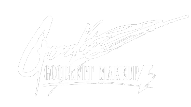
When I first started makeup 5 years ago let's be honest, I had no idea what I was doing. I really wanted to push the idea that my focus was special effects and pay homage to the old school. Jeremy Richie ( https://dribbble.com/jeremyrichie ) designed me an amazing logo. I told him I wanted it to look like a silent film card. They would use these cards to give titles and dialogues between scenes. It made me think of Lon Chaney who was an actor that always did his own monster makeups during the silent film era in movies like "Phantom of the Opera", "Hunchback of Notre Dame", "London After Midnight", etc. The amazing logo Jeremy came up with mirrored that perfectly and served me well but as I grew into other styles of makeup it started to not make sense for what I was doing and the direction I wanted to move.
I downloaded some applications on my phone and worked up a logo that I thought would work as an umbrella for all the different types of makeup I wanted to do. I wanted something that when you saw it you knew from it's configuration it was mine. I remember hearing Stan Lee say that a good comic book character was recognizable even in just a silhouette which I thought worked for logo’s text as well, like Metallica, Marvel, and Vans to name a few. Basically something that you could plug different letters into and parody but it still looks the same and recognizable. I finally got it close to where I wanted it but having made it on my phone it looked a bit rough. My good buddy Antonio Pantoja ( https://www.antoniopantoja.com/ ) offered to help me clean it up. He suggested a few changes in the font of the word "Makeup" which was originally cursive and we dropped the word artist. It was clean and concise and worked for really any type makeup I was doing and I can’t thank Antonio enough for helping me fix it up.

Photo By Danny Alexander

After spending 3 years with that logo as awesome as I still think it is it didn't really speak to who I was. This was no one’s fault but my own. I had wanted a brand that was palatable to all and didn't really think about it saying anything about me as an artist. Antonio had done an amazing job helping me sharpen it all up and refining the branding. At the time we made it I just wanted a catch-all logo that covered all the bases. I had no idea how to make a logo or branding that spoke to who I was. Starting from scratch the elements I wanted added were all over the place. They were everywhere from ravens, to David Bowing. I also knew I wanted something that would work independently of my name like a symbol similar to Nike's Swoosh or the McDonald's Arches.
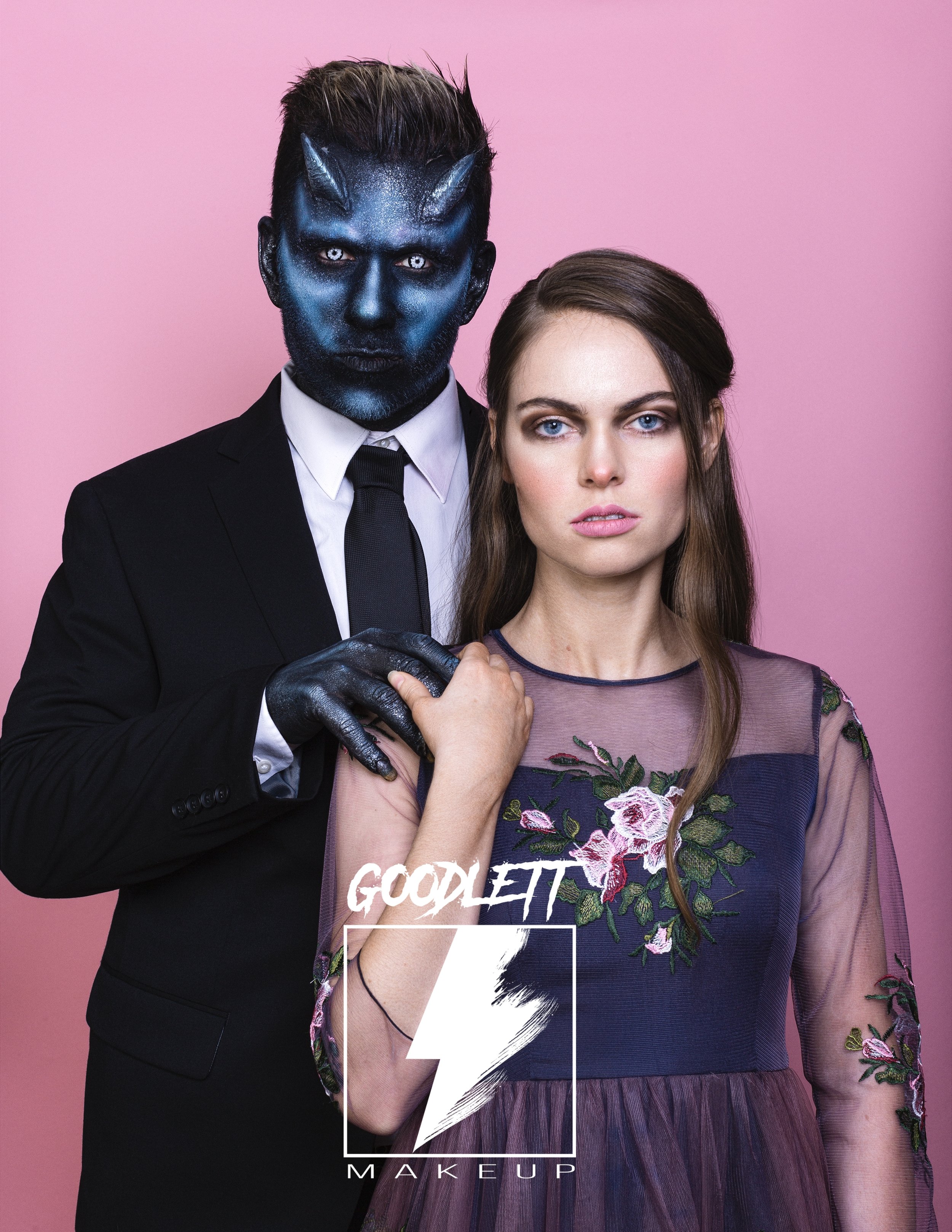
Photo by Donovan Cole
Models, Myself and Olivia Duff
Styled by Andie Kaye
No, I am not comparing myself to huge companies like that but I just feel like my name can be a bit clunky and wanted something that could maybe stand alone from my name. I knew I was asking a lot of my Friend Matt Niehoff of ThoughtFly ( https://www.thoughtflystudios.com/ ) who agreed to help me. He would send me some designs and I would send some notes back. I felt like I was being way to picky because everything he sent me was great. He invited me into his studio where we could work on it together. When I walked in there it was, up on his monitor. Not exactly what we ended up with but pretty close. We tweaked the Bowie inspired lightning bolt and he gave it some feathery brush strokes on one side which not only brought in the raven in a way but my style of painting. Hard lined and graphic makeup on one side mixed with loose brush strokes, It was perfect.

Photo by Danny Alexander
Models Mallory and Avery Grant

There are so many Matt's (2 in this blog alone) so we also decided to drop off my first name. I am so happy with how this new logo looks and have the different ways in which it can be displayed. I am stoked to have a clean concise logo that I can look at that I can use across SFX, beauty, fashion, runway, body paint, etc. and still see elements of myself within the logo. I can’t thank Matt Niehoff enough for putting up with my insane artist mind and helping me create a brand identity.
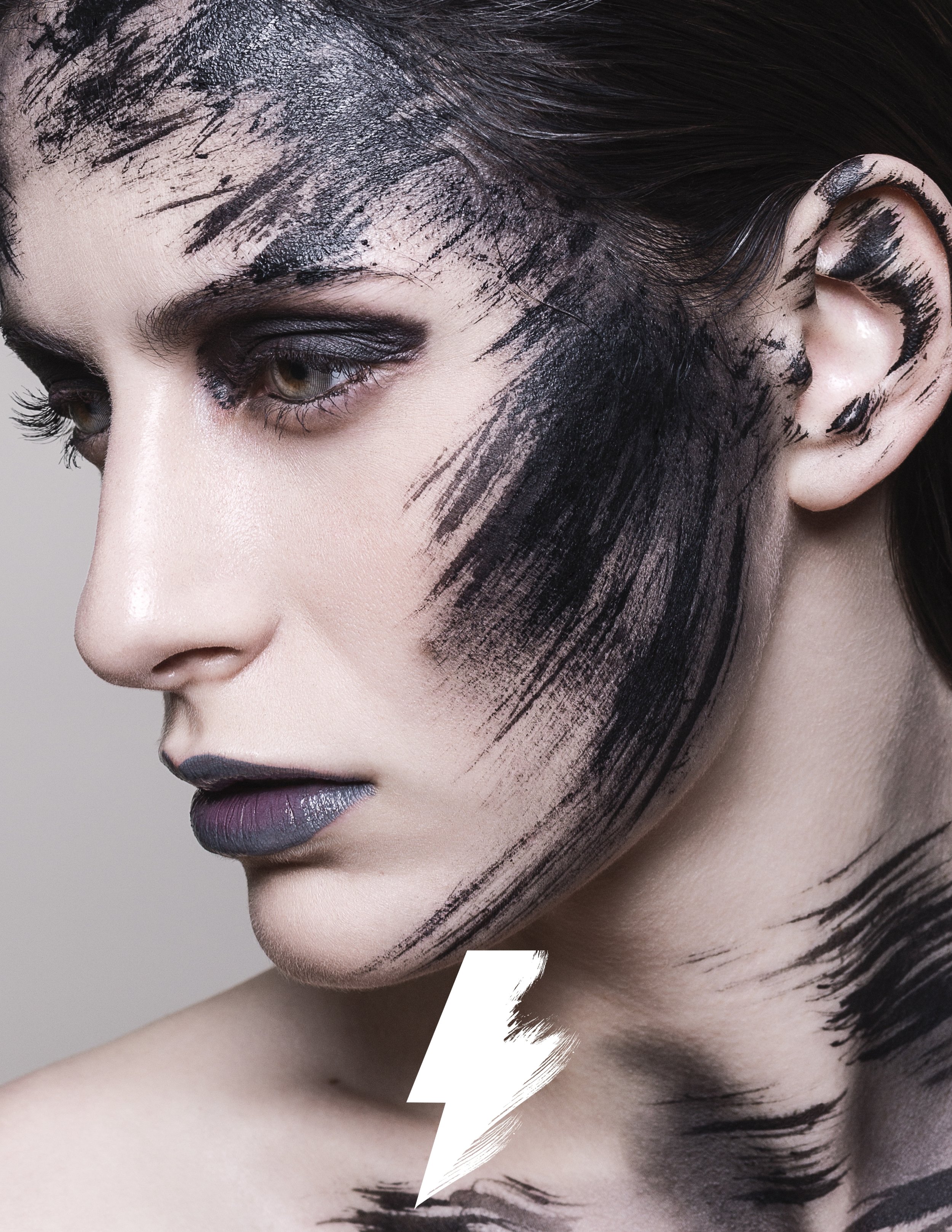
Photo by Donovan Cole
Model Moriyah McShane
